3

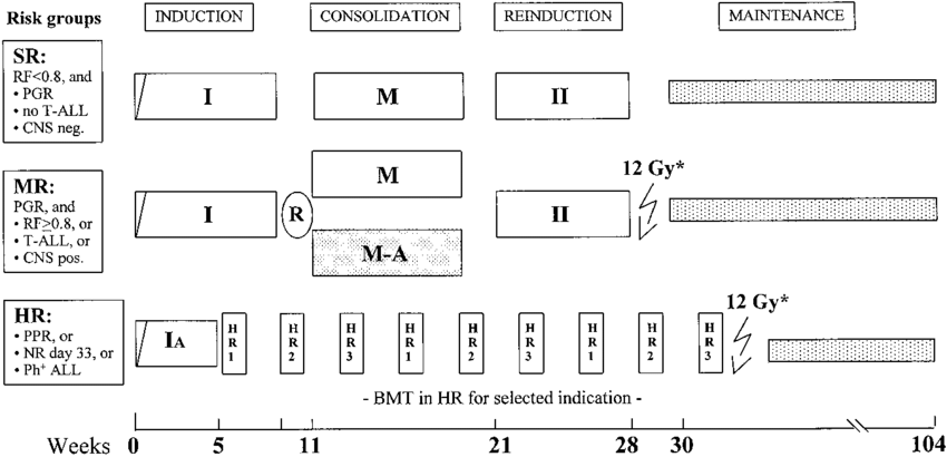
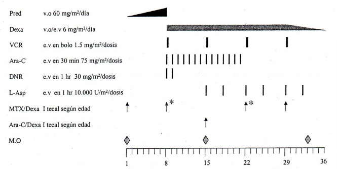
I am doing research on treatment plans and protocols in order to design software to minimize error when indicating medicine, procedures, exams, etc. We also want to monitor treatment and somehow adherence to the protocol. We started working with lymphoblastic leukemia in children and have seen the types of diagrams attached to the end of this question.

  • What are these diagrams called?
  • Is this a formal, documented notation?
  • Are they used to specify anything other than oncological treatments?

enter image description here

enter image description here

enter image description here

4
  • This seems very very broad to me, and the number of different questions makes this quite clear, as SE Q&A is meant to be single answers to single questions. I think you need to talk to some clients rather than using StackExchange for this one.
    – Bryan Krause
    Commented Aug 11, 2020 at 16:07
  • Thanks for your input. I have reduced the number of questions. I would just like to know more about this notation. The answer does not have to explain how to read them just where they came from and where to know more about them. I haven´t found anyone who knows and don't have any clients yet... just doing the research.
    – supercoco
    Commented Aug 11, 2020 at 16:29
  • Talking to clients (meaning potential users of your proposed software, not people paying you yet) is a key step early on in a project. Don't neglect it. It's the first research step. The further you get without doing it the deeper hole you dig.
    – Bryan Krause
    Commented Aug 11, 2020 at 16:32
  • Actually I have spoken with a few oncologists and they have explained how to read the charts and how to use them to monitor treatment. The problem is, they have no idea what these diagrams are called and if there is an "oficial" documentation that explains the notation and how to create these diagrams. They also have no idea if they are used outside of oncology. That is the reason I am posting here.
    – supercoco
    Commented Aug 11, 2020 at 16:49

3 Answers 3

1

The first one is a Treatment Schedule from the Acute Myeloid Leukemia - Berlin–Frankfurt–Munster Study of 2004.

The image can be found on page 39 of the article found here:

Randomized trial comparing liposomal daunorubicin with idarubicin as induction for pediatric acute myeloid leukemia: results from Study AML-BFM 2004

Ursula Creutzig, Martin Zimmermann, Jean-Pierre Bourquin, Michael N. Dworzak, Gudrun Fleischhack, Norbert Graf, Thomas Klingebiel, Bernhard Kremens, Thomas Lehrnbecher, Christine von Neuhoff, Jörg Ritter, Annette Sander, André Schrauder, Arend von Stackelberg, Jan Starý, Dirk Reinhardt

or specifically:

BLOOD, 4 JULY 2013 x VOLUME 122, NUMBER 1

1

As indicated in the first answer, the first figure is for a clinical trial. This kind of figure is often called a "Clinical Trial Design Schematic" or simply a "Schematic for a Clinical Trial."

Here are some other examples of trials that present such figures and label them as “clinical trial design schematic” or “schematic.”

https://www.researchgate.net/figure/Schematic-design-of-the-clinical-study_fig1_260005337

https://www.researchgate.net/figure/MAGELLAN-1-part-1-clinical-trial-design-schematic-In-part-1-of-the-MAGELLAN-1-study_fig1_313022113

https://www.ncbi.nlm.nih.gov/books/NBK533357/figure/cl3.f2/

There appear to be no rules for creating this kind of figure for a trial. Time is consistently on the x-axis.

The second two figures appear to be "schematics" that show the overall treatment plan for patients with cancer. There does not appear to be a specific name for this kind of graphic presentation of a treatment plan. There do not appear to be official rules for how these graphics are drawn. Time is consistently on the x-axis.

Oncology treatment plans are often shown graphically as "algorithms." This is a figure that shows the "algorithm" for treatment of acute lymphoblastic leukemia in 2013 from the Leukemia and Bone Marrow Transplant Program of British Columbia.

These (roughly) follow "rules" for flow charts as they are described in widely accessible public documents (WIKIPEDIA).

https://en.wikipedia.org/wiki/Flowchart

http://www.leukemiabmtprogram.com/healthcare_professionals/cancer_management_guidelines/ALL.html
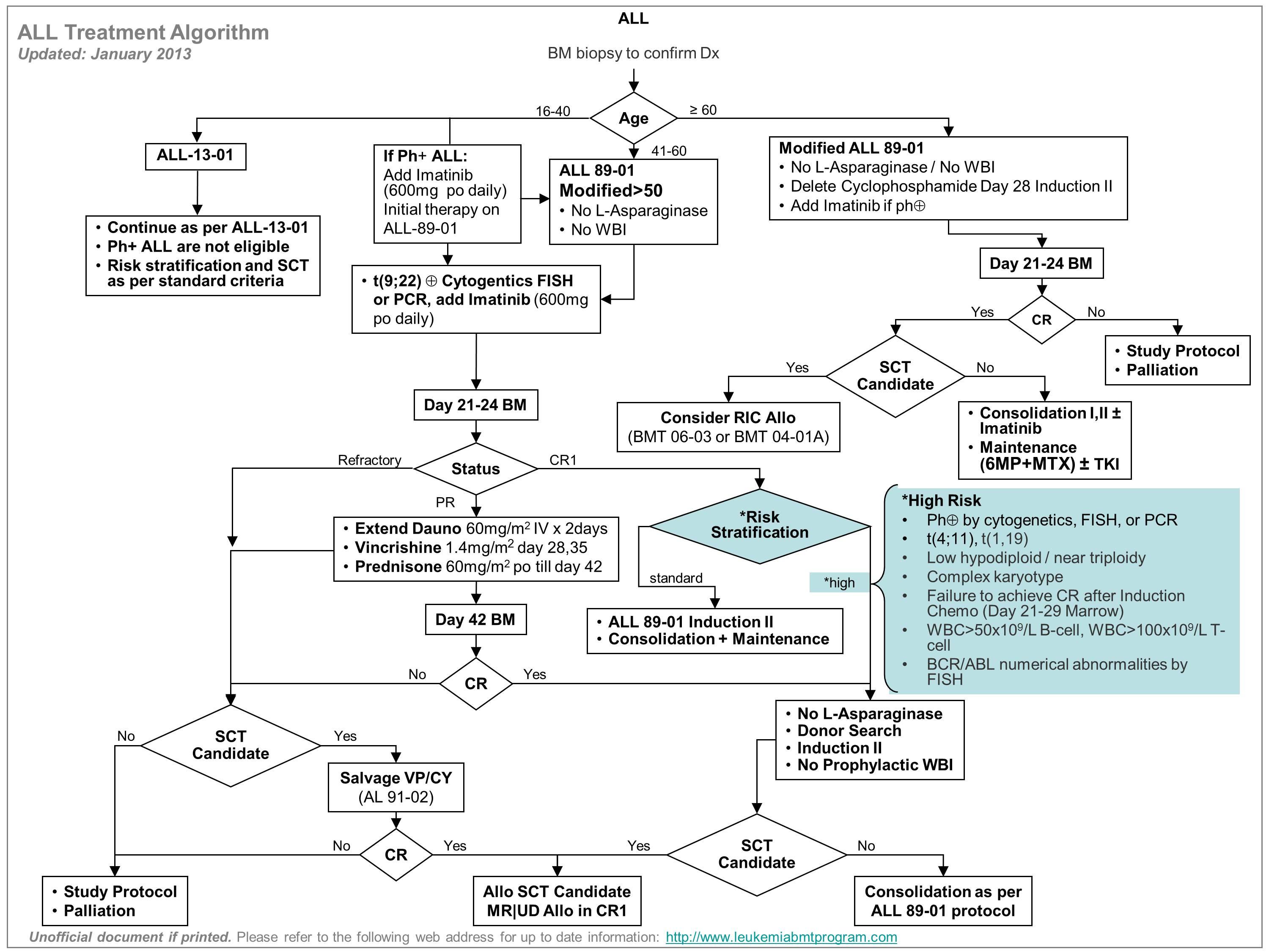
Algorithm for Acute Lymphoblastic Leukemia Treatment

0

It seems the first two diagrams are general treatment plans. You could also say it is a general view of the clinical pathway to follow for those two different cancer diagnosis.

The third image is a detailed pharmacological treatment that comes if you "zoom in" or "double click" a box in the first two diagrams. It shows what drugs must be taken in certain days.

I have found no formal definitions or documentation for this type of notation though I have seen these notations in english, spanish and german documents. So I still think that someone invented it and must have some sort of consensus on the elements of the notation.

There seems to be an effort to document clinical pathways using BPMN, CMMN, and DMN. (https://www.bpm-plus.org/healthcare-and-bpmn.htm).

Your Answer

By clicking “Post Your Answer”, you agree to our terms of service and acknowledge you have read our privacy policy.

Not the answer you're looking for? Browse other questions tagged or ask your own question.